A number of terms are used for visualising data, for example, infographics and data journalism, but whatever you call it, there is no doubt that this emerging field is growing in popularity — and Will Stahl Timmins, information designer at the BMJ shared his insights at our recent meeting on infographics. (If you couldn’t make it, click here to see Will’s presentation.)
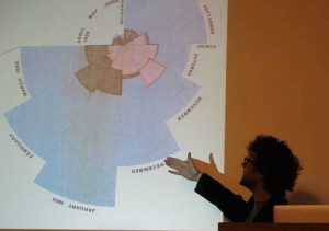
As he explained, the concept of infographics is not a new one. Bar charts and line graphs were used to display data in the early 1800s, and, in the middle of that century, Florence Nightingale produced her now famous coxcomb graph, illustrating preventable deaths during the Crimean war.
John Snow was another pioneer in data journalism, mapping cholera outbreaks in nineteenth century London to identify the source of the infection.
However, 21st-century technology now allows journalists and designers to work together to produce all-singing, all-dancing interactive graphics.
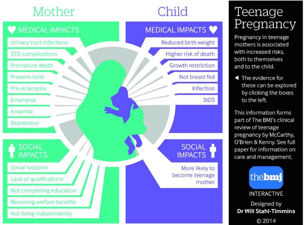
Will show-cased some of his recent work, including “Sugar: spinning a web of influence”, which illustrates the complicated, interconnected relationships between the sugar industry and UK government advisory bodies on nutrition. And “Manifesto positions”, which shows the main parties’ positions on health and where they overlap.
The purpose of these interactive graphics is both explanation and exploration, said Will. Visualising data allow journalists to simplify complex information and present it in an impactful way so that readers absorb it more easily, he explained.
This latter point was the subject of Will’s previous work at Exeter University medical school. Will and his colleagues conducted a randomised controlled study to determine whether readers would absorb information more readily from the Intergovernmental Panel on Climate Change report when it was presented as text or as a flow diagram.
Although the text group spent longer reading the information, those in the graphics group scored higher in a test of their knowledge about the report, particularly those in the younger age group. Perception of the risk of climate change was also higher in the graphics group, and this difference in perception remained two weeks later, although the difference in knowledge scores did not.
To finish up, Will gave some helpful hints for journalists who would like to work with information designers to co-create graphics, or even start producing their own infographics.
Standard tools, such as Excel numbers and Infogram, can be used to create simple graphs; specialist tools, like http://raw.densitydesign.org/ and Adobe Creative Suite can be used for static or motion graphics; and software such as that available at www.processing.org or www.d3js.org can be used to create more complex, interactive graphics.
You can follow Will’s work via his blog. Journalists looking for infographic inspiration can also try:
www.informationisbeautiful.net


Recent Comments